Giles de
Laval
A basic familiarity
with the techniques and conventions of heraldic art
is an invaluable asset to a scribe. Heraldry is an
important part of the scribe’s work, as
heraldic devices appear on all armigerous scrolls
produced by the College (Awards of Arms, Rose
Leaves/Leaves of Merit/Court Baronies that carry an
Award of Arms, Grants of Arms and Patents of Arms).
With a little practise and a few tips up their
sleeves, most scribes will be able to become
competent heraldic artists.
Preparation
With your scribal
assignment sheet you will receive a copy of the
Herald’s Device Submission Form, which has
both a picture of the device and a verbal
description. ( A device is the design on the
shield, which is called Arms after the owner gets
an Award of Arms. The picture is called an
emblazon, the description is called a
blazon.)
In the bottom right
hand corner of this form you will find “Blazon
on LoAR” along with a stamp. This stands for
the description on the Letter of Acceptance and
Return, which the Laurel Sovereign of Arms sends
out when a device is registered. Check that this
blazon matches the blazon on the scribal assignment
sheet. Next, check that the blazon on LoAR
describes the device accurately, as changes might
have occurred between the device being drawn and it
being registered.
Unfortunately, blazons
are not written in plain English. They are in a
special jargon sometimes called
“Heraldese” which is derived from Norman
French terminology. It’s actually much less
scary than it looks, and you will get used to it
fairly quickly. Check with a herald, or with the
office of the Provost if you’re not sure about
the translation. Trust me, it’s much better to
get everything 100% clear right at the start than
risk having the scroll rejected if the heraldry is
wrong.
Also on the device
submission form of a section called “Notes for
Scribes”, where the recipient might request
specific things, such as “please white for
argent instead of silver” or “please draw
the charges exactly as shown”. These requests
should be accommodated if possible.
Research &
Design
Because not all
submittors or herald are accomplishes artists, you
may need to find better drawings of the charges (a
charge is an item shown n the shield). The best
place to look for them is in a good book heraldry,
such A Complete Guide to Heraldry by
A C Fox-Davies, or Heraldry: Customs, Rules
and Styles by C A von Volborth. Your local
herald will most likely have one or both of these
books, and they are readily available from good
bookstores. A good introductory heraldry book is an
investment that will repay itself many times
over.
It’s a very good
idea to lay out the whole design in pencil first.
That way you can check that everything’s there
that needs to be, and that the design looks
balanced.
If you don’t feel
up to drawing the charges (or an other design
element) freehand, copying or tracing them until
you do feel more confident is perfectly acceptable.
Don’t make the charges too small; they should
fill up the available space.
Use mechanical aid
such as a ruler, set square and compass whenever
possible. It may take a little bit longer, but the
result will be much better. A roundel drawn
freehand, for example, cannot compare with one
drawn with a compass. Don’t trust your eye;
measure everything.
If you’re doing
an original scroll, you should also give some
thought to the “accessories”: the shape
of the shield, the helmet, crest, supporters,
etc.
The standard heater
shaped shield is quite appropriate to any style of
scroll after the 12th century. In period, women
displayed their Arms on a lozenge (diamond shaped
shield). SCA ladies are entitled to use a lozenge,
but most choose not to, so if you want to do this
please check with the recipient first. For some
styles, a more specific type of shield can add a
great deal to the consistency of the scroll, for
example, a round or rectangular shield would be
appropriate for a 9th century Celtic scroll; a kite
shield for a 12th century Romanesque scroll; a
“horsehead” shield for Italian
renaissance; a notched “tartsche’ for a
16th century German scroll.
Some things like
supporters or coronets, or the style and
orientation of the helm, are restricted by rank.
Details of what is permissible and appropriate will
be advised by the Provost with your assignment.
Painting
Tips
There are only a few
colours or tinctures used in heraldry. These
colours were originally chosen so that the bearer
could be easily identified at a distance or in the
confusion of battle, so it is important that the
colours used to paint Arms are unambiguous, strong
and bright. Recommended colours for heraldic
painting are:
- Or (gold/yellow)
-imitation gold, cadmium yellow pale, gold
leaf
- Argent
(silver/white) -zinc white, Chinese white. Do
not use silver leaf
- Gules (red)
-cadmium red pale, spectrum red
- Azure (blue)
-ultramarine
- Vert (green)
-mistletoe, permanent green middle
- Purpure (purple)
-purple lake, mix carmine and
ultramarine
- Sable (black)
-lamp black, ink
- Proper -an item
shown in its “proper”, or natural,
colours
Purple Lake can be
difficult to work with, as it can be streaky and
prone to fading. I find it preferable to mix my own
purple from carmine and ultramarine. The shade
should be a strong “mid” purple, neither
too red nor too blue.
Of using gold leaf,
lay it on first. This is so little flecks of gold
don’t get stuck in existing paint, and
burnishing won’t damage painted
areas.
Avoid silver leaf,
because it will tarnish and turn black quickly.
Aluminium leaf and fake silver leaf may be
acceptable substitutes. Silver paint can be tricky
to handle, so it’s best to stick to white for
painting the Arms.
The shield has the
design painted on it in flat colours, so don’t
shade the charges to look three dimensional.
Outlining and some detailing is all that’s
required. Surrounding objects like the helm,
mantling and supporters can certainly be modelled
with shading, but not the shield.
It’s good
practice to outline and detail all charges in
black. A pointed 000 brush, a crowquill or a fine
technical pen are all good for this task. If
outlining dark coloured charges (sable and
sometimes purpure), bleed-proof white gouache is
excellent, as it won’t smear with the
underlying colour like ordinary white does.
Outlining makes the painting look
“finished”, and gives the charges a great
deal of clarity, which is after all the point of
heraldry.
Decorative
Heraldry
Now that you’ve
got the basics of heraldic art under your belt, the
question is, where do I go from here? The answer
is, anywhere you want. Heraldry lends itself
wonderfully to decoration and artistic
achievement.
Diapering is a means
of adding subtle richness to a device. It is
usually an abstract swirl, leafy motif or small
geometric patterns done in a slightly different
shade of the base colour. It is often seen in
stained glass depictions, where the medium enables
the diapering to be seen to its best
effect.
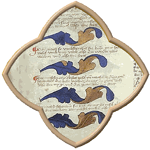
Look through period
manuscripts for ideas on how to work heraldry into
your illumination-they are full of heraldic art
waiting to be plundered. Research different types
of shield and helm to use on scrolls. Using the
recipient’s own helm can be a nice
personalised touch, especially if you spruce it up
with a bit of ornamentation. For a continental
European look, try tilting the shield (but not for
Spanish or Portuguese armoury, as it denotes
bastardy in those countries). Have fun playing with
the mantling-it can be painted as realistic drapery
or fantastic tattered swirls.
Supporters have lots
of decorative potential. A shield could be grasped
by a grotesque, or hung by a strap from a gothic
ivy bar. Dürer drew a lady holding her
beloved’s shield, and another shield hung
around a stag’s neck. Some elaborate Germanic
designs show a supporter bearing the shield slung
about their neck resting on their shoulder, and
actually wearing the crested helm. There are many
possibilities here-look through period sources for
ideas for the more decorative kind of supporters,
as the more formal paired supporters are restricted
to use by Royal Peers.
A very period
technique is to scatter a charge or variation
thereof, or the recipient’s badge repeatedly
throughout the border as a decorative element. You
could also work in things like mottoes, badges of
the award (Laurel branches, for instance, or drops
of blood for the Pelican), or objects that relate
to the recipient’s interests or Arms. Always
keep this subtle and appropriate. A good example of
this is the (modern) grant of Arms to the British
sportswear company Lillywhites Limited. Since the
company’s device featured stylised lilies, the
scroll’s border is composed of naturalistic
depictions of several varieties of lily. Sly humour
can also be displayed, as in another modern grant
to a solicitor’s firm: a symbol for each
partner is included as a play on his name, amid an
elaborately tangled border of red (filing)
tape.
With a little research
and practise, you will find that you will become
steadily more familiar with heraldry, and will be
able to use heraldic art to enhance the pageantry
and beauty of scrolls you create.
Some recommended
books:
A Complete Guide
to Heraldry, by A C Fox-Davies, Bonanza
Books, New York 1978, ISBN 0-517-2643-1
Heraldry: Customs, Rules and Styles,
by C A von Volborth, New Orchard Editions, Dorset
1981, ISBN 1-85079-037-X
An Introduction to Heraldry, by Stefan Oliver, New
Burlington Books, London 1987, ISBN
0-948872-29-2
Heraldry, by Henry Bedingfield &
Peter Gwynn-Jones, Bison Books, New York 1988, ISBN
0-86124-994-1
Heraldry: Decoration and Floral
Forms, by Herbert Cole, Crescent Books, New
York 1988, ISBN 0-517-66665-0
|